Australian Cotton Ginners’ Association (ACGA)
Logo Design | Branding | Website Design
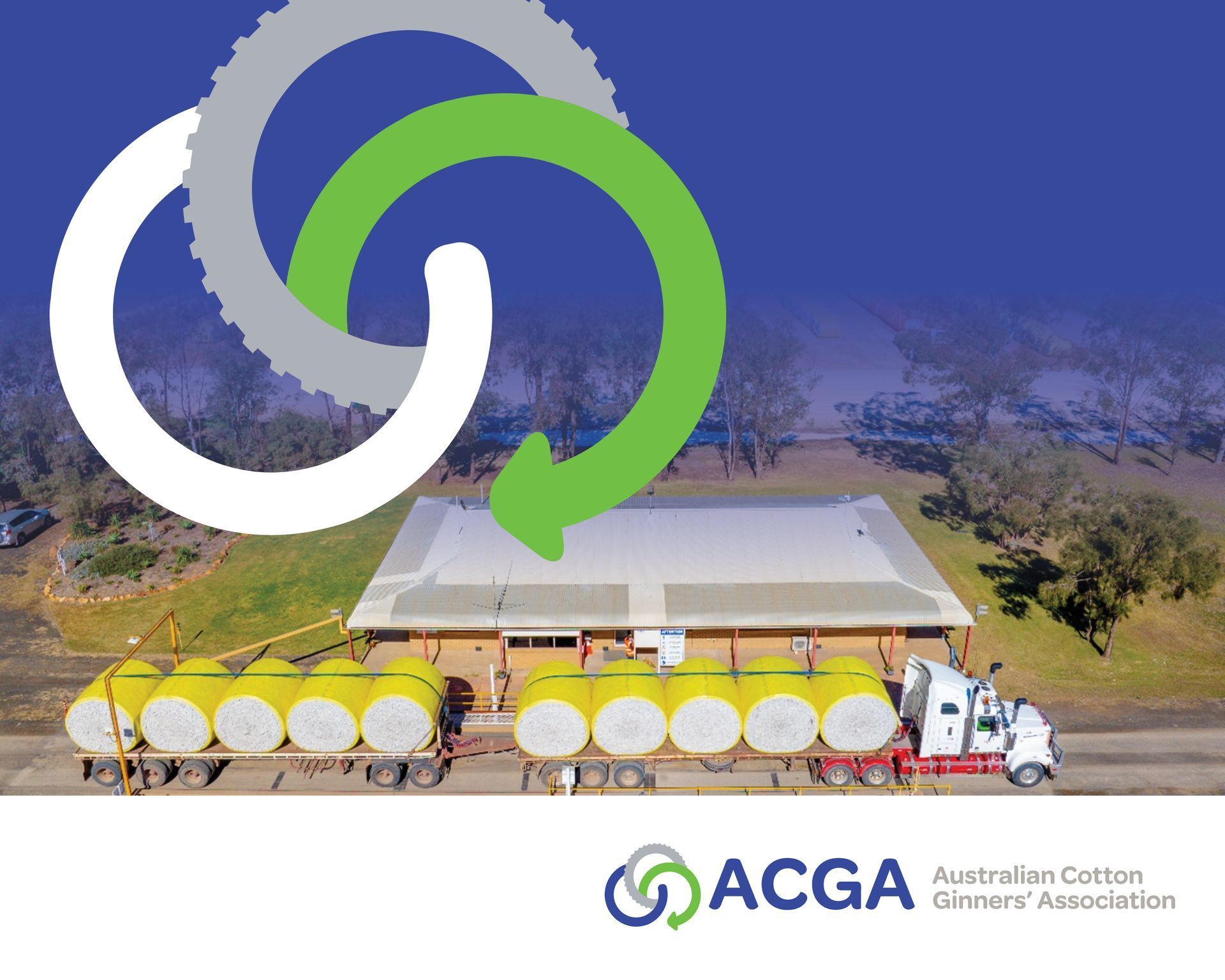
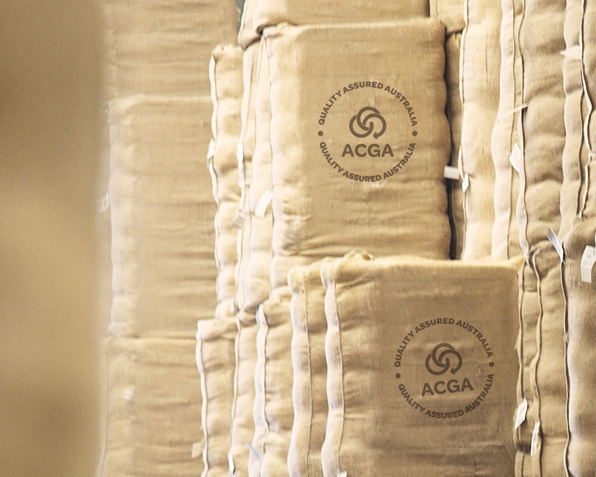
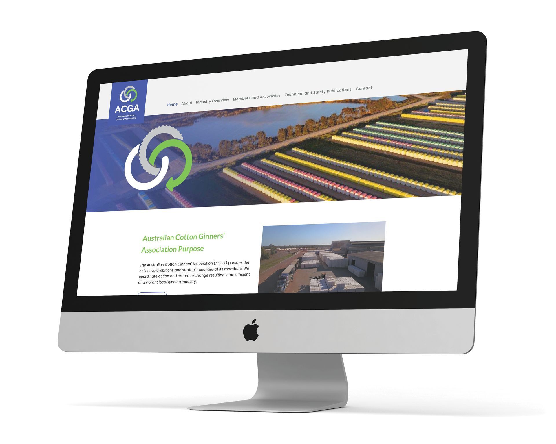
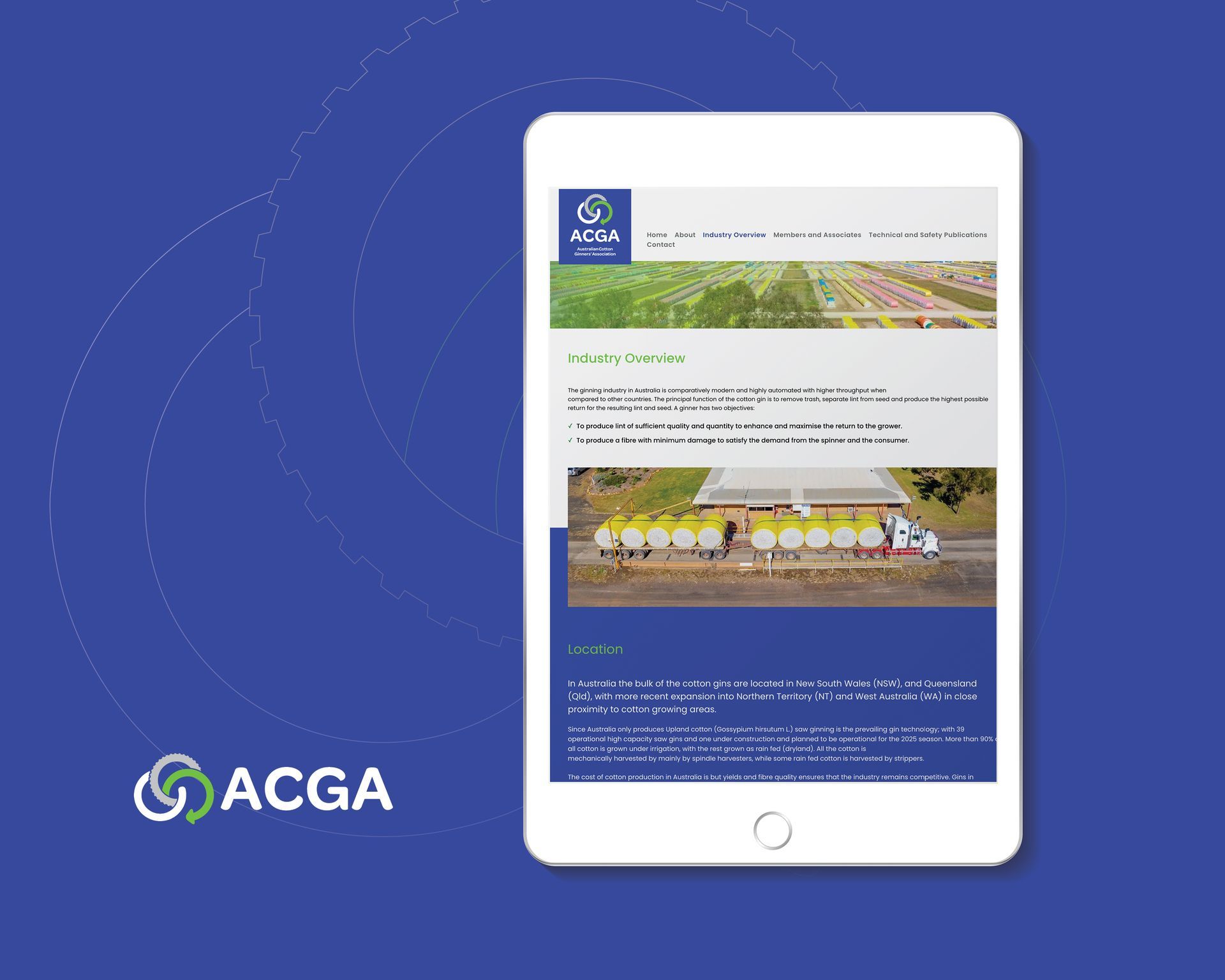
The Australian Ginners’ Association (ACGA) wanted an approachable brand presence that would represent the organisation as an important link in the industry’s cotton supply chain. The logo and brand identity we created reflects this sentiment and speaks to growers, the greater cotton community, manufacturing as well as government and CRC organisations. The logo mark has been derived from an infinity symbol, while the addition of a third circle creates the shape of a cotton boll. The topmost circle has a ‘saw’ edge, while the other features an ‘arrow’ - suggesting movement, energy, leadership, direction and action. The gin saw is important in the ginning process where fast-moving circular saws grip the fibres and pull them through narrow slots to separate seed from the lint. This logo shows this process in a simplified and symbolic way. The interlocking circular shapes visually symbolise the ‘partnership’ of the various bodies required for the cotton industry’s successful future. Circles commonly represent solutions and show unity, integration and wholeness, giving a sense of completion, confidence and harmony. The colours used are bright and engaging and assist in creating a look of hope and optimism for the future. What a fantastic way to weave your way to success, with a new brand identity designed by Black Canvas!
What Black Canvas did
Logo design | Branding | Website design | Strategy plan design
Ben Suttor, President
Brief us.
Have a project your want to talk about? We would love the opportunity for Black Canvas to develop your new identity and help take your business to new heights.
Contact Us
Thank you for contacting us!
We will get back to you as soon as possible.
Oops, there was an error sending your message. Please try again later.
