Criterion Hotel
Logo Design
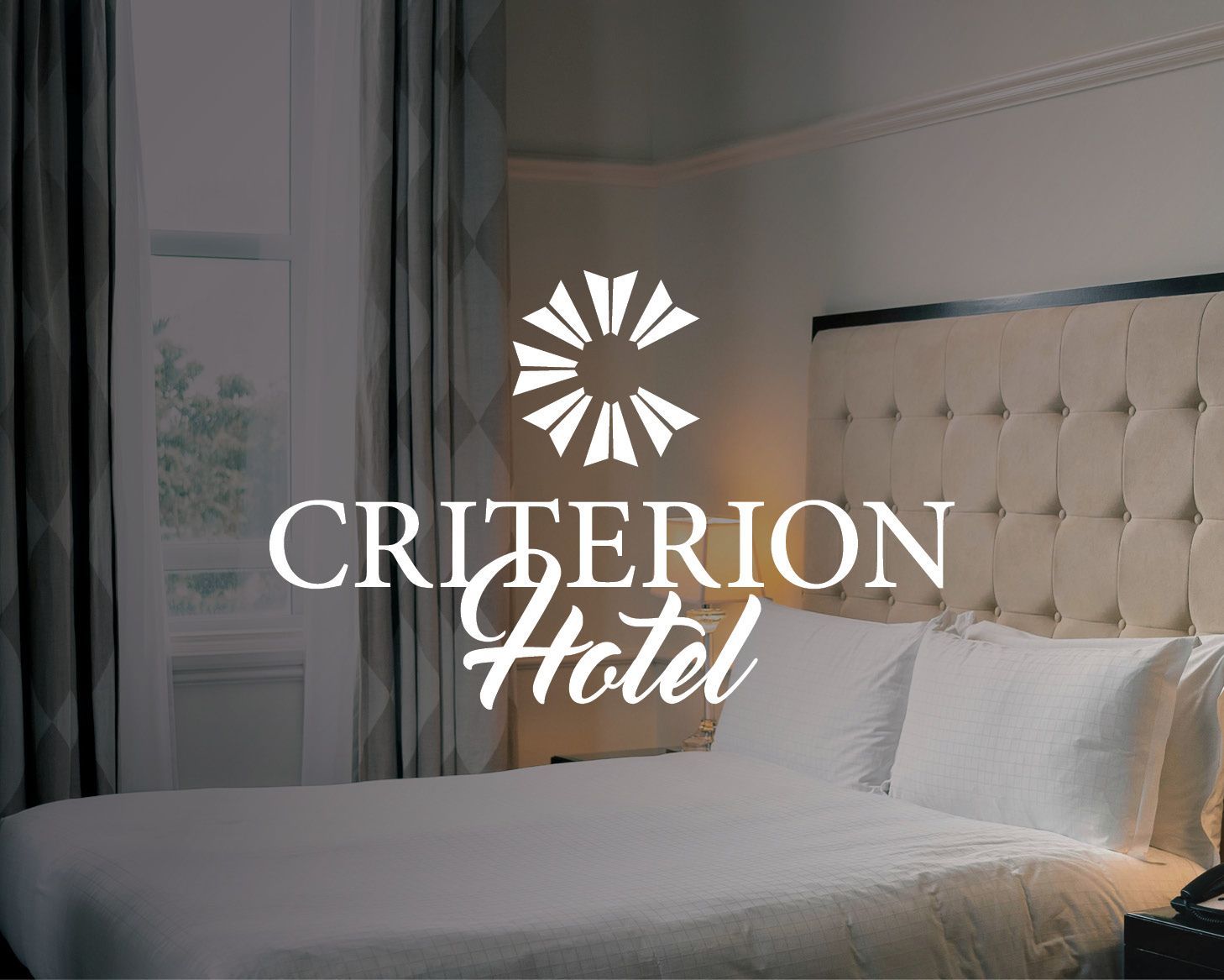
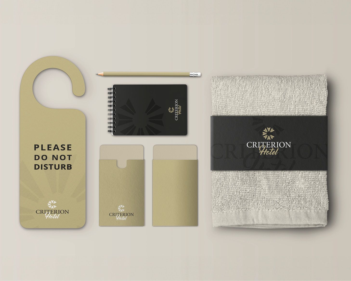
The main selling points for the Criterion Hotel are its great service, consistent quality, and stellar location. For their branding, it needed to be both traditional and clean while nodding to their surroundings—a tall order, but we think we've nailed it.
The icon, resembling a windmill (reminiscent of the Dalby surrounds), has been modified into a stylised letter "C". The colour choices match the building's feel, and by using two contrasting fonts - a classic serif and a cursive brush font - the logo gains a personal touch.
What Black Canvas did
Logo design
Brief us
Have a project your want to talk about? We would love the opportunity for Black Canvas to develop your new identity and help take your business to new heights.
Contact Us
Thank you for contacting us!
We will get back to you as soon as possible.
Oops, there was an error sending your message. Please try again later.


