Kate's Place
Logo Design
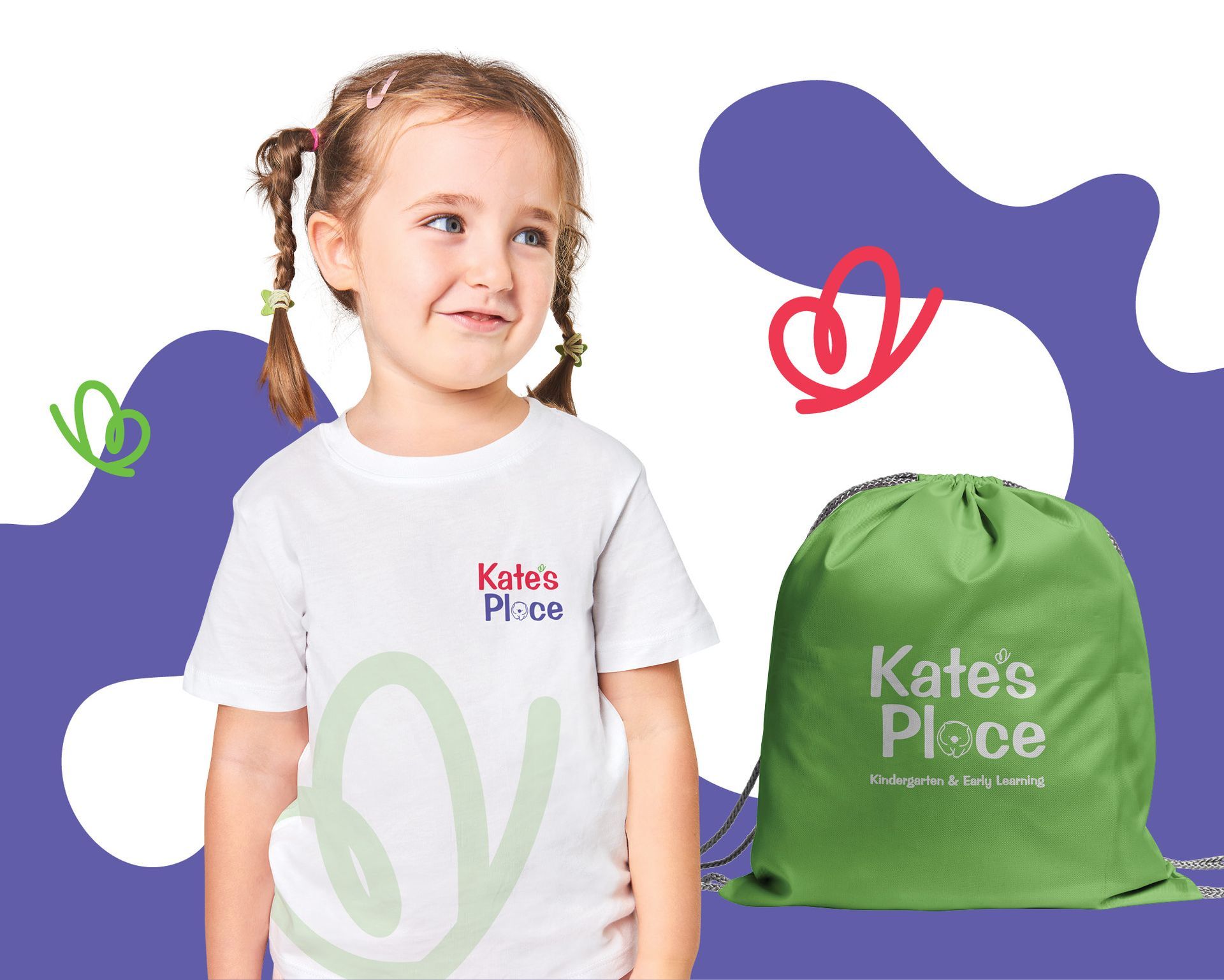
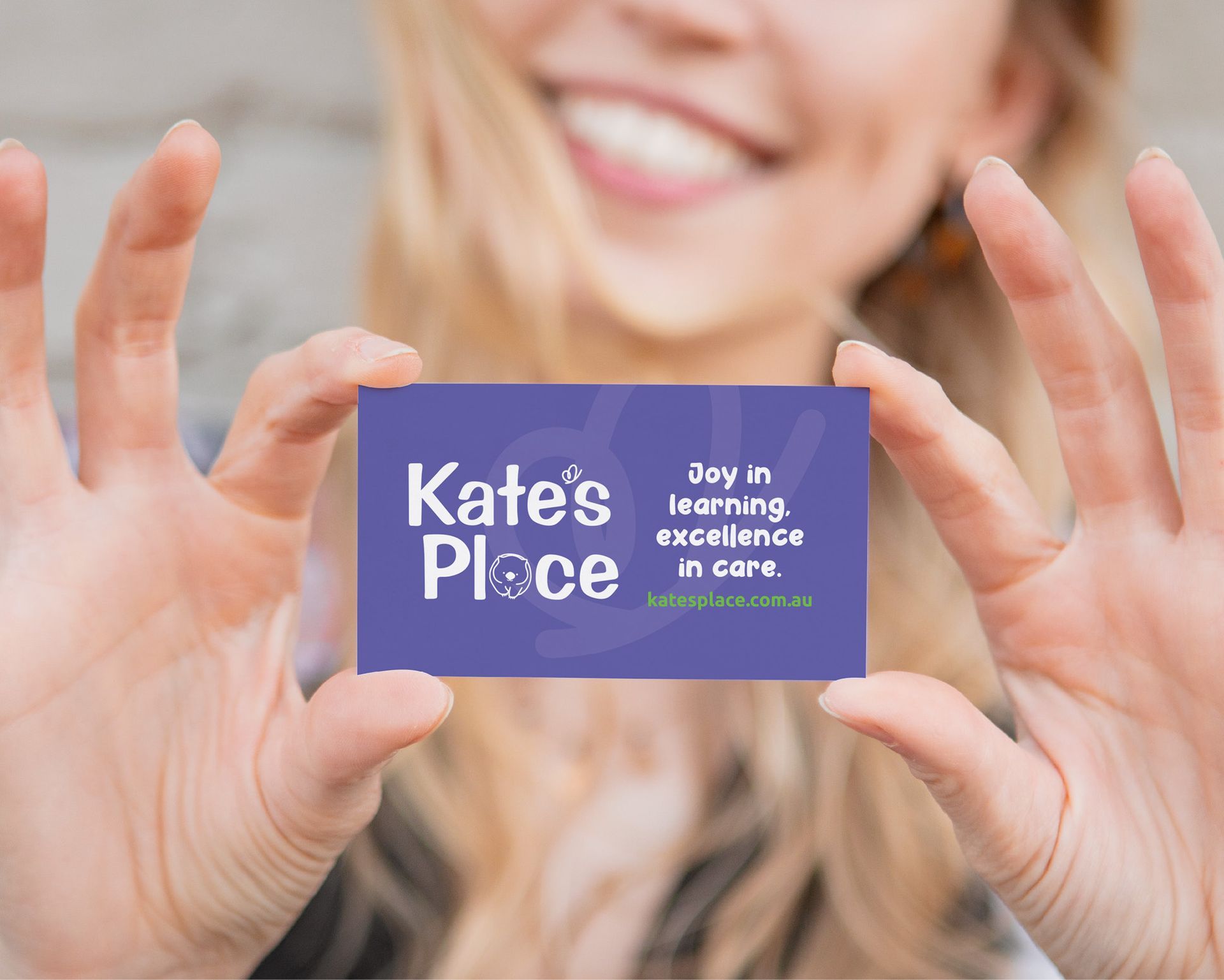
For Kate's Place, we aimed to create a visual identity that resonates with young children and their families. Our team chose vibrant colours and playful shapes to evoke a sense of joy and curiosity, making the logo an inviting symbol of the brand. The friendly typography was carefully selected to ensure readability, appealing to both kids and parents alike.
The logo reflects the spirit of exploration and learning, which is conveyed in the warm and welcoming atmosphere Kate's Place offers. We had so much fun with this one!
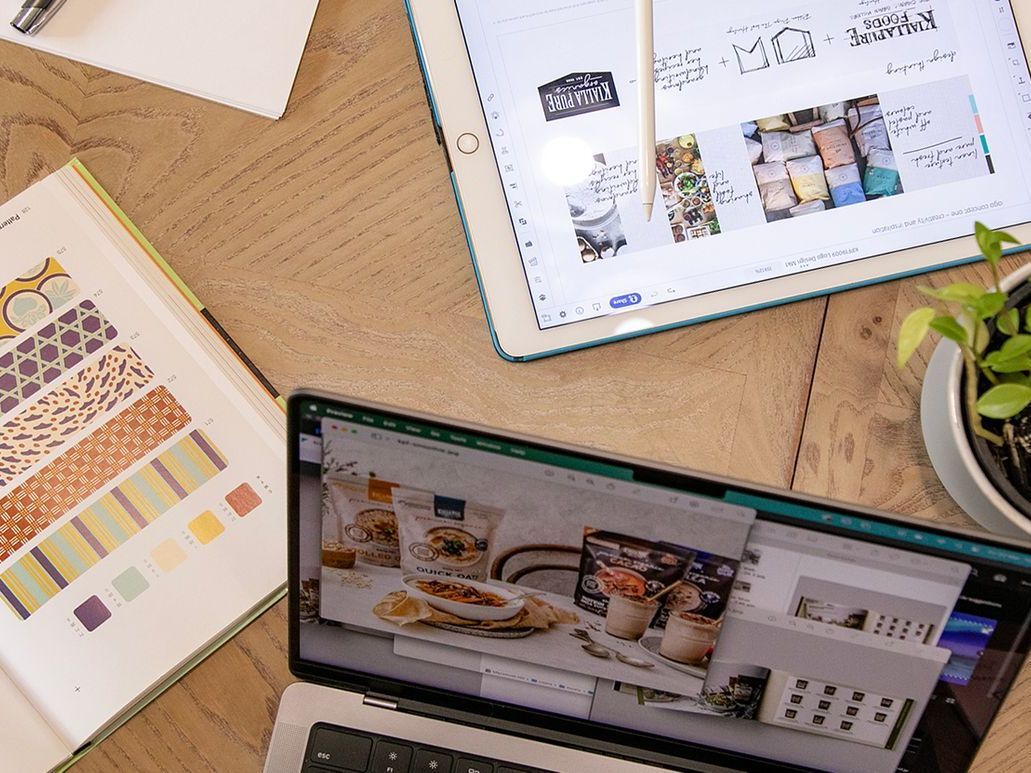
What Black Canvas did
Logo design


Kate's Place
Logo Design
For Kate's Place, we aimed to create a visual identity that resonates with young children and their families. Our team chose vibrant colours and playful shapes to evoke a sense of joy and curiosity, making the logo an inviting symbol of the brand. The friendly typography was carefully selected to ensure readability, appealing to both kids and parents alike.
The logo reflects the spirit of exploration and learning, which is conveyed in the warm and welcoming atmosphere Kate's Place offers. We had so much fun with this one!
What Black Canvas did
Logo design
Brief us
Have a project your want to talk about? We would love the opportunity for Black Canvas to develop your new identity and help take your business to new heights.
Contact Us
Thank you for contacting us!
We will get back to you as soon as possible.
Oops, there was an error sending your message. Please try again later.